You know how you sometimes instantly regret a purchase shortly after? Many people purchased the Nothing Phone 1 because it dared to be different with its Glyph lights on the back panel. On first impressions, the Nothing Phone 2 was more of the same. After weeks of usage, I’m happy to say that isn’t the case. For those with instant regret, don’t worry. The smartphone gets better every day (except in one area).
The Nothing Phone 2 is evolving into one of my favourite smartphones of the year and I’ll tell you why.
Much more than the Glyph lights
The one thing that separates the Nothing Phone 2 from the plethora of Android smartphones in the market is the glyph lights on the back panel. There’s also the Nothing OS 2.0 and its monochrome design that is a breath of fresh air in a sea of dull/monotonous Android OS skins.
Before we get into the nitty-gritty, let me just apprise you of the specifications, in case you’ve been living under a rock.
The Nothing Phone 2 rocks the Snapdragon 8 Plus Gen 1 mobile platform from Qualcomm and is accompanied by 8GB/12GB of RAM and 128GB/256GB/512GB of storage. There’s a gorgeous 6.7-inch LTPO OLED display (241x1080 pixels) with a peak brightness of 1600 nits and a 120Hz refresh rate. The smartphone comes with Nothing OS 2 (based on Android 13) out of the box. There’s a 4,700mAh battery under the hood. The smartphone supports 45W wired, 15W and 5W reverse wireless charging speeds. The smartphone weighs just 201.2g.
The glyphs take centerstage
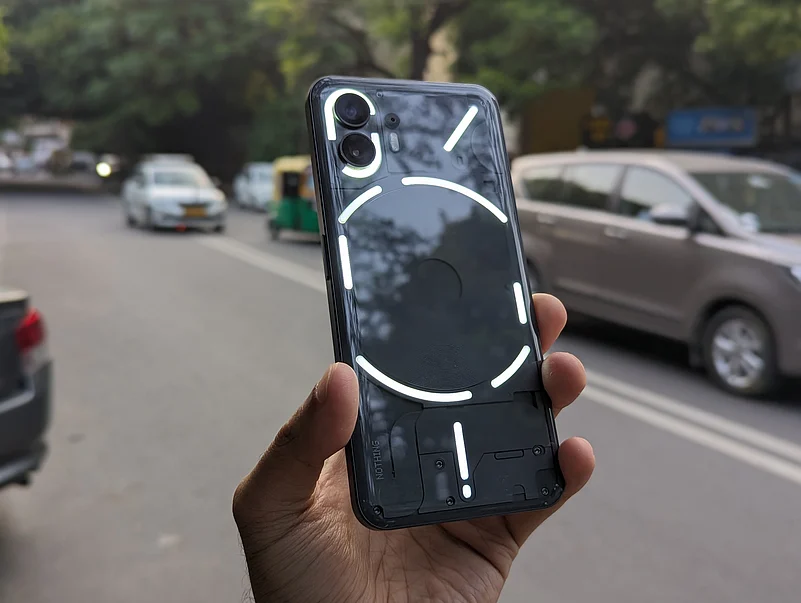
Whether you like it or not, the Glyph system (aka the cluster of LED lights) is the highlight of the Nothing Phone 2. They glow on the rear of the smartphone like none other. They reveal who is calling/messaging, which app is being used, and the status tracker for Uber rides and Zomato deliveries. They can even be used as a timer.
It’s designed to make you use your smartphone less and less. There are now 11 LED lights, up from Nothing Phone 1’s five. What’s even better is that third-party developers can take advantage of the new system. It’s a travesty that Nothing didn’t onboard many more developers before the launch, but it seems that slow and steady wins the race.
The Glyph UI can be customised in many ways. There are many presets already loaded and there is even a Glyph composer to create your own LED patterns and ringtones. You can create a personalised Glyph for every contact of yours.
Nothing OS 2.0 and cameras
Why am I clubbing the 2.0 and the cameras into one section, you may ask? Well, let me take you back to last year’s Nothing Phone 1.
When a new brand emerges, there’s always one thing you’re sceptical about: software updates. To my, and everyone’s surprise, the software updates were regular and with them came one camera improvement after another. I was genuinely impressed with how the cameras on the Nothing Phone 1 were far better six months after the launch.
The Nothing Phone 2 seems to have reversed that trend. While the software updates are consistent - already been three big updates since the launch - the cameras haven’t much improved.
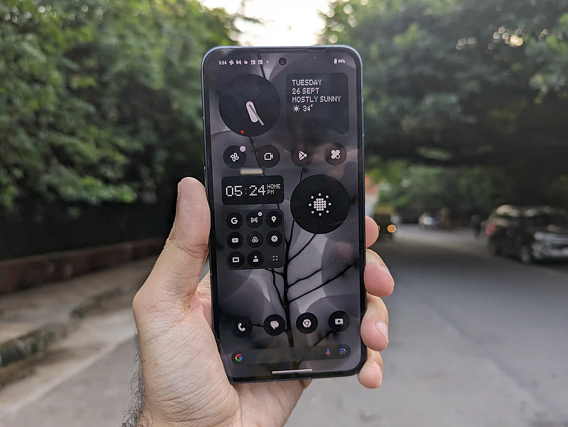
The Nothing OS 2.0 features a monochrome UI that is built around Nothing’s own font. It’s a retro-style dot matrix that stands out.
Every app is monochrome, and that’s something that you have to get used to. But there is so much customisation possible. You can remove the names of apps, arrange the apps in any way and even enlarge some of your most used apps.
It has a clean UI and is very soothing to the eye. One other customisation that I like is that you can put a quick setting as a widget on the home or lockscreen.
The cameras on Phone 2 are similar to the setup on Phone 1. There’s the same 50-megapixel main camera but with a newer Sony IMX890 sensor. There are dual rear lenses and a single selfie camera on the front.
The photos came out with vivid colours and good detailing and show a considerable improvement over the phone’s predecessor. The images are well-balanced and even the wide-angle camera shots came out well.
The one thing I noticed is that when the images are blown up, say on a 32” monitor, they lack sharpness and some details are missing.
Unfortunately, there’s no telephoto camera and the digital zoom is nothing to write home about. I was hoping that Nothing would deliver a blockbuster update with some new camera enhancements but unfortunately, that’s still left to be desired.
The battery easily lasts a day
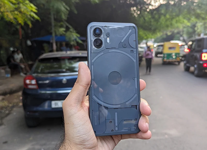
A standout feature for me has been the battery life. A full charge will take you less than 55 minutes and the battery will easily last about 40 hours on a single charge. I consistently got six hours of screen-on-time. This was with medium-to-heavy usage.
There is a 4,700mAh battery and coupled with the powerful and efficient Snapdragon processor, the phone never gives you any anxiety.
Nothing doesn’t provide a charger in the box, like many other companies, but there is support for wireless charging and even reverse wireless charging.
Verdict: Is Nothing Phone 2 better than Phone 1?
Is the Phone 2 a worthy sequel to Phone 1? The answer is a definite yes. Nothing has consistently delivered software updates, the phone never gets warm, and thanks to the powerful Snapdragon chipset, the phone flies through daily tasks.
The Glyphs are genuinely fun (I’m hoping more developers come on board) and the cameras are good, if not the best-in-class.
There are some other competitors that may attract your attention but Nothing has done more than enough to differentiate itself from the crowd. I’d suggest you take a look at the Nothing Phone 2 before anything else. It’s a genuinely fun and exciting smartphone that keeps getting better with every software update. It is one of my favourite smartphones of 2023.


